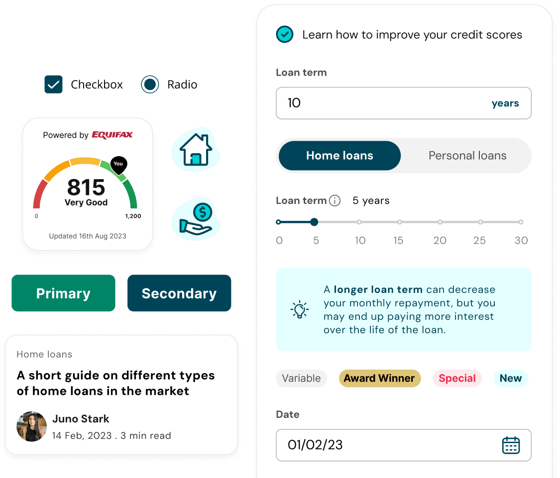
Overview
When I joined RateCity, a financial comparison platform in the Canstar Group, the design team had no shared foundation to work from. I drove the push to change that, building the company's first design system from scratch and migrating everything to Figma.
The problem
Files were split across Adobe XD and Sketch with no clear system between them. The working method was to find the most recent version of something, duplicate it, and make changes on top. No components, no shared styles. Just an ever-growing pile of disconnected files with no clear source of truth.
The result showed up in the product: inconsistencies across financial verticals, developer handoffs that created confusion, a team spending time recreating things that already existed somewhere in a file nobody could track down. It was unsustainable.
I brought a proposal to my team lead: use the Figma migration as the foundation for something more substantial. Not just move files across. Build a proper design system the whole team could work from.
Laying the foundations
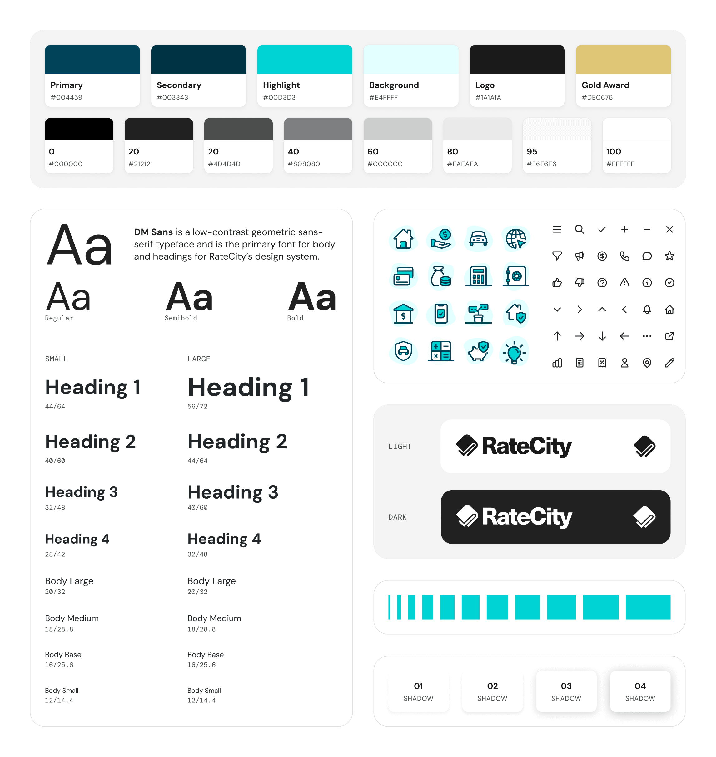
We built from the ground up, starting with the raw materials before touching a single component. Colour palette, typography scale, spacing system, and a unified icon set, documented and shared so every designer was working from the same base.
Building the component library
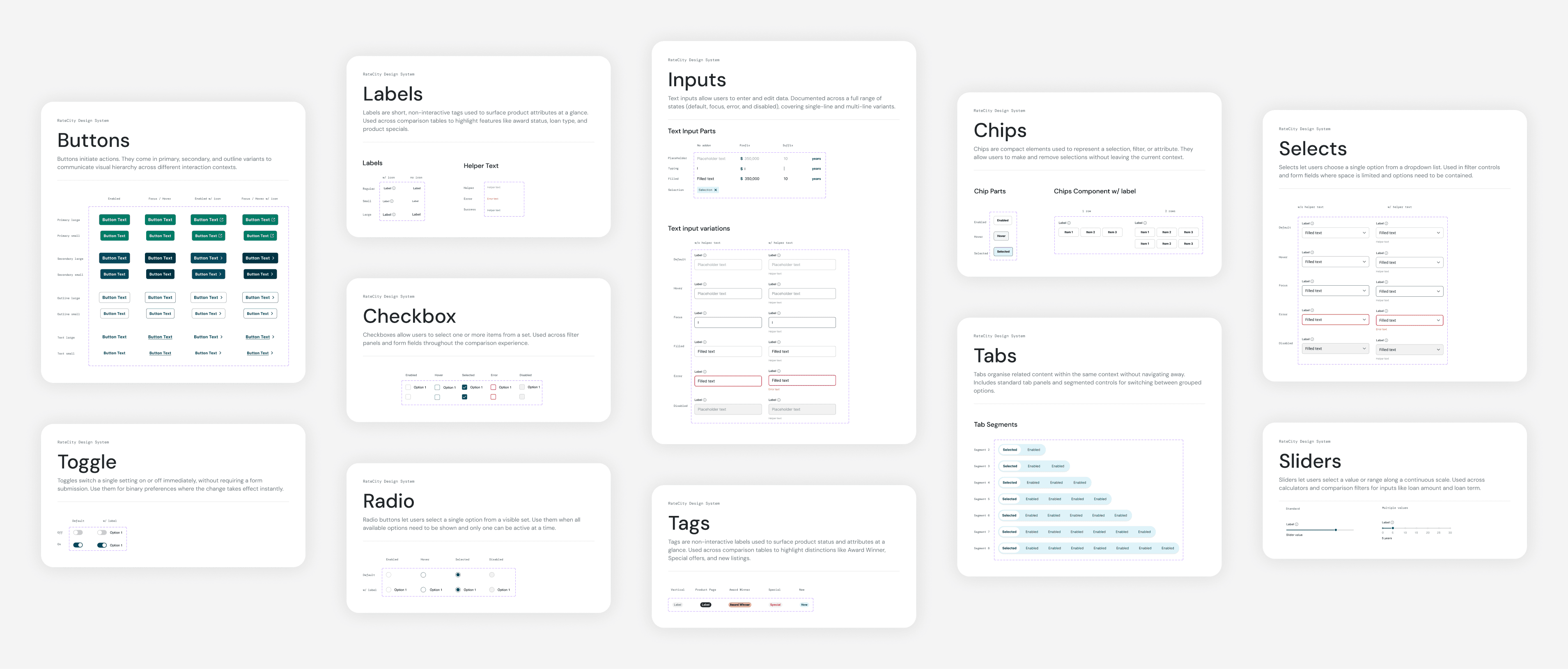
With the foundations in place, we moved to the building blocks. Text inputs, selects, segmented buttons, checkboxes, radio buttons, toggles, sliders, chips, labels, tabs, tags, and radios. Each component was documented with its parts, states, and variants.
Scaling the system
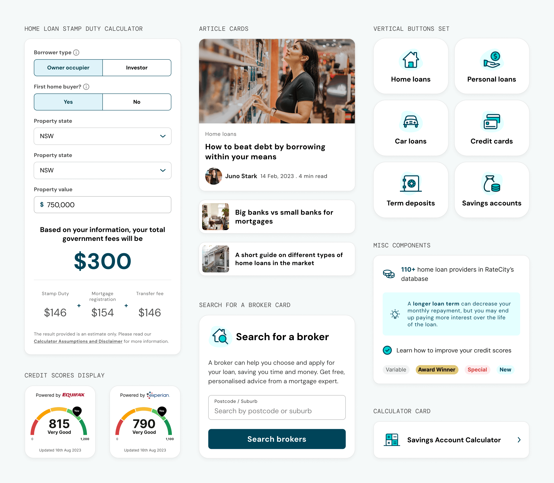
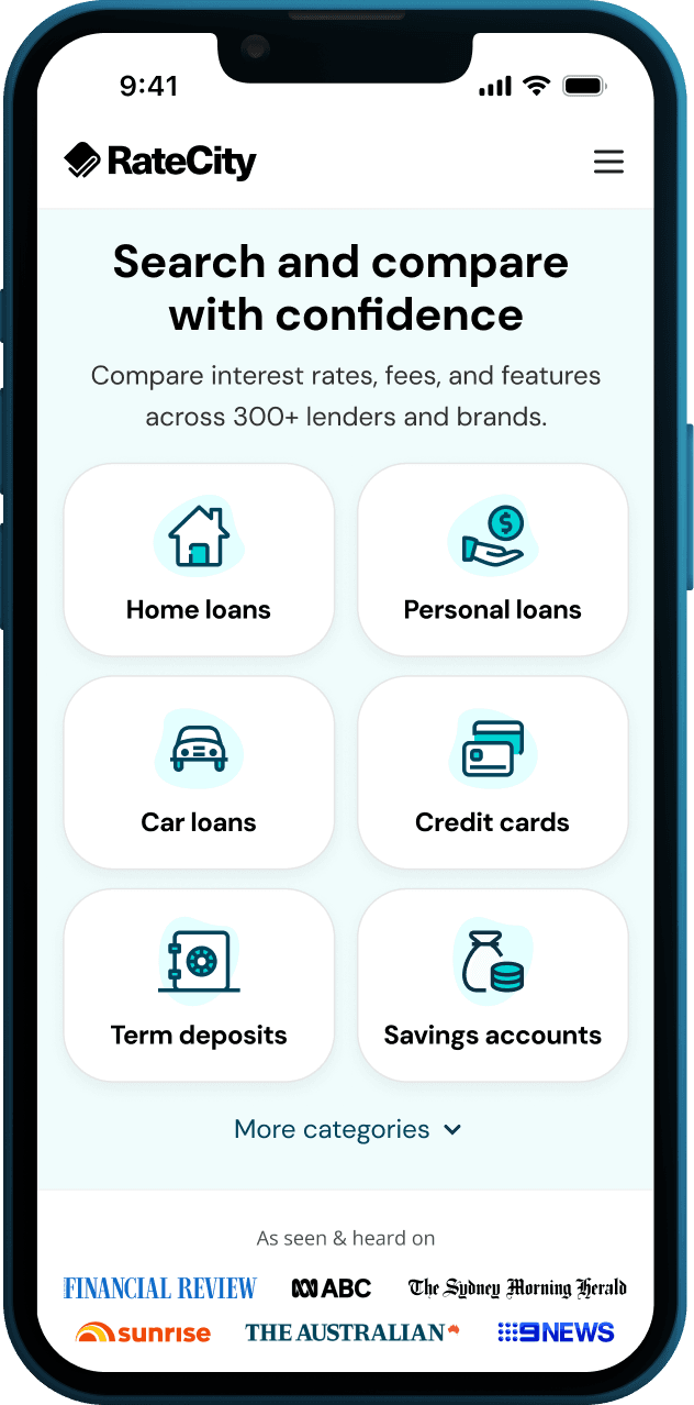
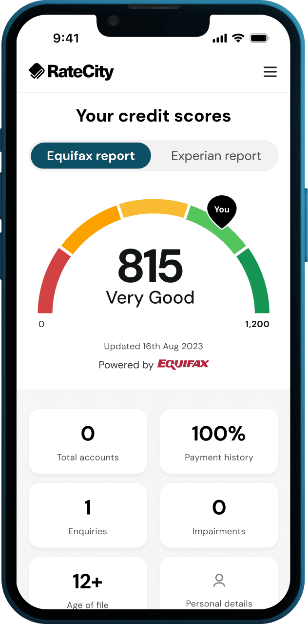
From there we moved up to larger patterns. Financial calculators, article cards, credit score displays, broker search, and the vertical navigation tiles that appeared across every page on the site. The engineering team were also building out their React component library in Storybook, and the two efforts stayed closely aligned throughout.
Designing for comparison
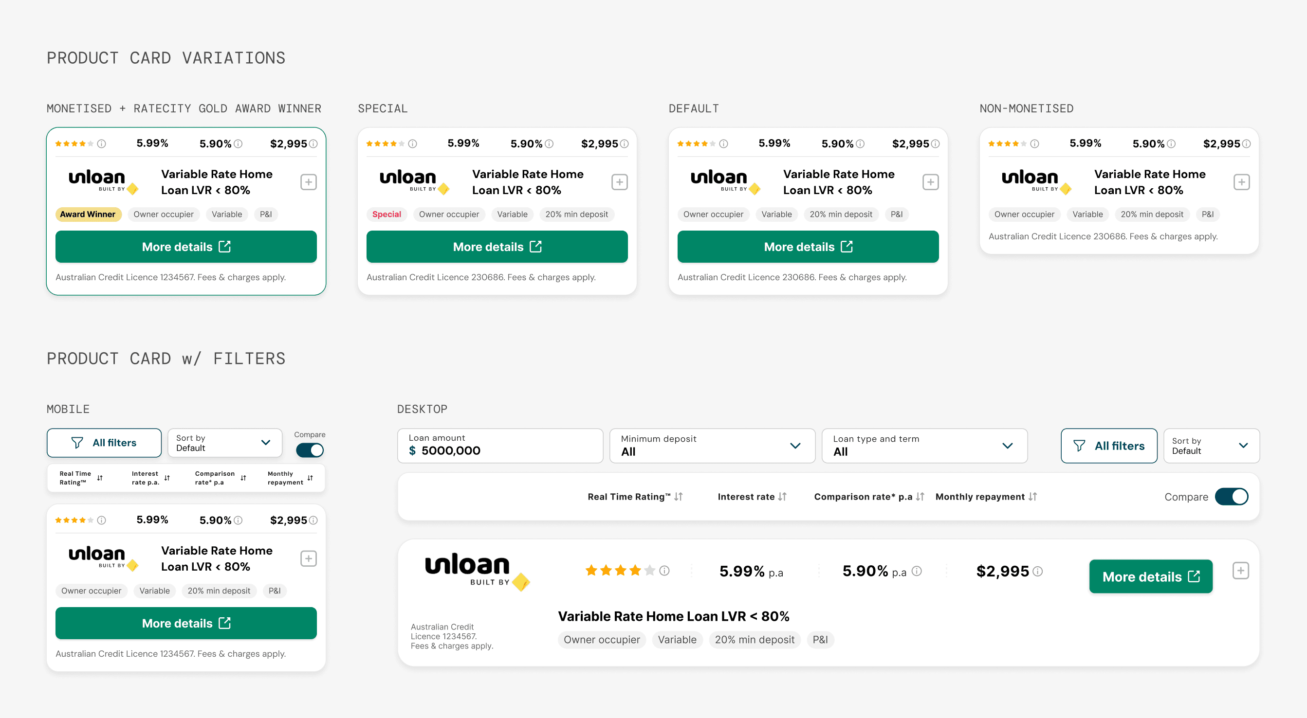
Comparison product cards had to work across multiple variations within the home loans vertical: a default state, a special offer treatment, a monetised placement, and a non-monetised version. Each needed to surface the right information clearly while remaining consistent across the table.
Filtering and discovery
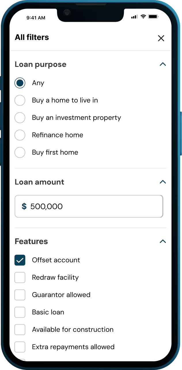
On desktop, filters sat inline above the table, giving users immediate access to refine their results. On mobile they opened as a dedicated panel. The split was intentional: keeping the table clean on a constrained screen while still giving users full control over how they narrowed down their options.
Bringing it together
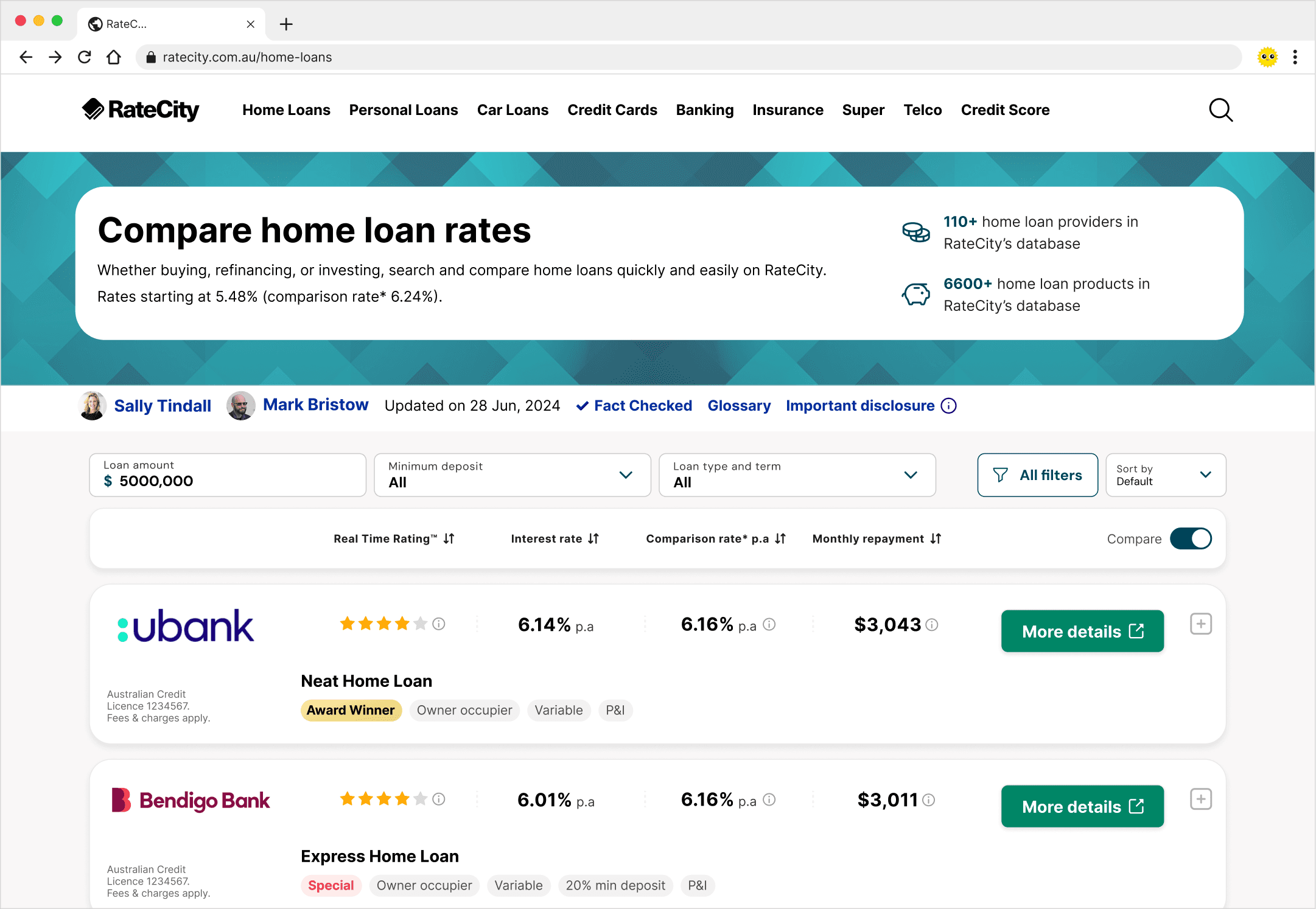
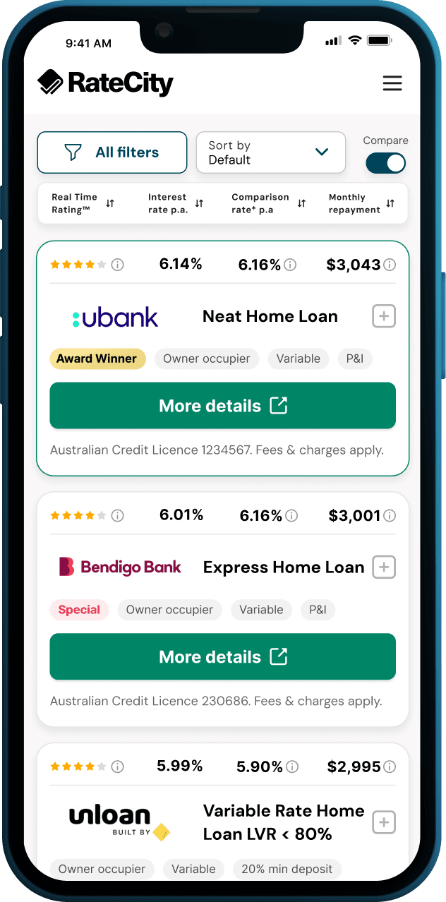
From the homepage to the credit score dashboard, the same shared foundations held across very different product surfaces.
The impact
Once the foundations were in place, the experience of working at RateCity changed in practical ways.
One source of truth
All three designers pulled from the same connected set of Figma libraries. Components, styles, and foundations maintained separately but working as one system. When something changed, it changed everywhere.
Smoother developer handoff
Developers received consistent, well-structured files. The back and forth that came from inconsistent designs dropped significantly.
Faster design output
With a trusted component library in place, new features and verticals were assembled rather than rebuilt from scratch.
Aligned with engineering
The Storybook integration meant both teams were working from the same component logic, not just the same visual reference.
What I took from it
A design system is infrastructure. It doesn't ship features, and users never see it. Making the case for that kind of work, inside a product environment with real delivery pressure, meant being clear about the value it creates: faster design output, fewer inconsistencies, less rework across design and engineering.
It also reinforced that a system is never finished. It grew as the product grew. Building something extensible rather than exhaustive was part of what made it work.